So, I need a little assistance. In a couple of weeks I get to start leading a Bible study on the life of the prophet Elijah – you know – the guy that God had the birds feed!
Typically, I make a notebook of materials for all the ladies in my group, complete with a personally designed cover, which is great fun for me.
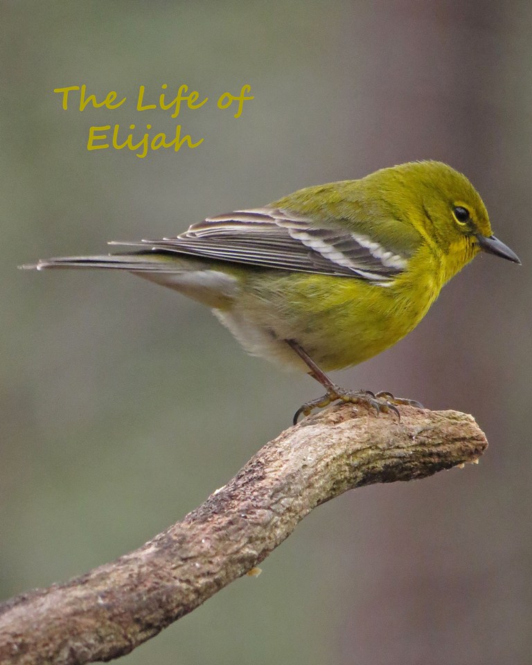
Which of these potential covers do you prefer, the Warbler or the Cardinal? I’m having a hard time deciding.

Thanks for your input!

The Warbler. I can’t really define why, maybe because he looks more modest?
The cardinal does look a bit more arrogant, but I guess he can’t help being so handsome! Looks like the Warbler wins. 🙂
I like them both! The color of your letters is a little easier on the eyes with the Cardinal. Perhaps a darker color like a dark brown would look a little nicer for the Warbler? Just an idea! Your photos look wonderful on both birds! 💙💜❤️
I think I may indeed play with the color of the letters a bit. 🙂 Thanks for the suggestion.
Warbler !
And pretty sure Warbler it will be!
Warbler! 🙂
I’m thinking that will be the one. 🙂
Warbler! I love cardinals, don’t get me wrong, but the warbler is just soooo awesome! 🙂
Thanks! I have had a ton of these guys lately. They are so vibrant and handsome.
Both are very good but I like the Warbler. I do agree the letting is a little easier in the cardinal photo but it is written on the branch.
Thanks. I might play with the letters a bit, but it looks like the Warbler is by far the favorite.
You can’t beat a cardinal!
Hmmm…looks like you are in the minority here. You must be the type that likes to color outside the lines! By the way, did you ever get to see your Cardinal?
Oh well! No I didn’t unfortunately. Blue jays a-plenty bit not a single cardinal sadly.
I love both of them. I guess it has to do with what character does God show me in the expression of each bird, which is closest to what I see Elijah as portraying? I would probably make the heading larger and bolder also. The warbler seems more trusting, and is ‘out on a limb’ so to speak as a prophet, his prophesies put him into dire situations. The Cardinal looks very serious and confident, which is not what I see Elijah, the Bible depicts him as a sensitive melancholic taken to depression, but extremely passionate for God’s will. I don’t know if that helps Kathy, but blessings on your Bible study. We start our first Life Group(bible study fellowship) for the year in our home this week also:-)
Very insightful. And I think I will enjoy the study very much!
I am with the warbler too.Probably something in the composition that gives him the edge.
Looks like the Warbler is indeed the favorite. Hard to go wrong with such a lovely bird. 🙂
I vote for the warbler.
I always think of ravens with Elijah, tho.
Ah…if only I had ravens in my backyard! Wouldn’t that have been perfect?!
Warbler!
Seems to be the favorite. Thanks for your input. 🙂
Warbler! I like the way the color in your letters matches the bird and his perch. Nice job! I also like the cardinal because he looks so stately, but Warbler wins! Enjoy your study!
I am really looking forward to the study. I think there will be a good number of ladies and we enjoy the time together. And it does indeed look like the Warbler will be the chosen one. 🙂
I am really looking forward to the study. And it does indeed look like the Warbler will be the chosen one. 🙂
I’m going to agree with almost everybody else and go with the Warbler! I also thought that Ravens would be appropriate, but Warblers work too! 🙂
Ah…if only there were ravens in my yard! But looks like the Warbler will do nicely. 🙂
They are both so beautiful I don’t think it would matter.
Kath.
I would take the warbler, but only because there´s more light in the picture. They are both wonderful, and I´m glad I don´t have to make the final decision! 😊
Definitely seems like Warbler is the winner. 🙂
Warbler too. (K)
Seems to definitely be the choice. 🙂
The Cardinal!
Thanks!
Both of them are really cute but as a visual designer perspective I’ll go with Cardinal. You can see the perfect contrast in background and foreground. The space around subject (Cardinal) I mean the first photo is edge to edge, here the subject is more prominently featured. Just need to play with typography( size, font, color etc) you can place it somewhere on the top like the in the first one you did, so it will be readable.
No doubt about photography both are equally great. These suggestions are only for cover design 😊
Excellent feedback. I think I will indeed play around with them a bit. 🙂
The Warbler gets my vote. I feel it fits better in the context. The emotion in the picture is right for the purpose 🙂
He does look a bit more humble? Pensive? Sober minded?
Humble, yes, friendlier and more likely to feed others than the Cardinal 🙂
You know my partial to the Cardinal, but for your cover my choice would be the Warbler, he seems more fitting. 🙂 Enjoy your study group!
I’m thinking it will be the warbler. I only shot a couple in Portrait orientation, so I didn’t have much to choose from.
I like the green one, you don’t see those very often. Also, I have nominated you for the Three Day Quote Challenge. You don’t have to participate, but I hope you will. Want to read the quotes you will share.
Hmmm…while I hesitate to commit to the challenge, I am indeed sharing a quote today. 🙂